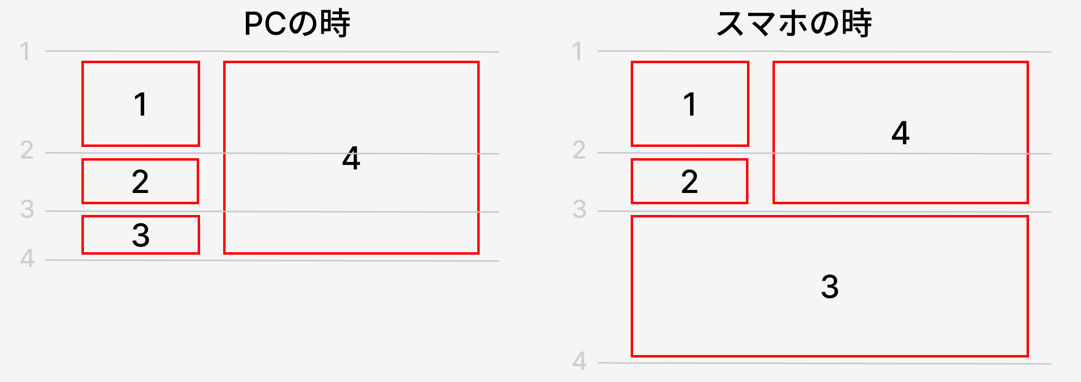
css grid でレスポンシブでレイアウトを変える
.grid {
  display: grid;
  gap: 16px;
  background-color: rgb(233, 233, 233);

  grid-template-columns: 1fr 1fr;
  grid-template-rows: 1fr 1fr 1fr;
}

.box {
  border: 3px solid red;
  background-color: #ff000011;
  color: #F00;
  font-size: 40px;
  display: flex;
  justify-content: center;
  align-items: center;
}
pcの時
/* pc  */
.item1 {
  grid-column: 1;
  grid-row: 1;
}

.item2 {
  grid-column: 1;
  grid-row: 2;
}

.item3 {
  grid-column: 1;
  grid-row: 3;
}

.item4 {
  grid-column: 2;
  grid-row: 1/4;
}
item4 は 高さが 1 〜 4 なので
grid-row: 1/4;
と記述します。
spの時
@media (width < 768px) {
  .item1 {
    grid-column: 1/2;
    grid-row: 1/2;
  }

  .item2 {
    grid-column: 1/2;
    grid-row: 2/3;
  }

  .item3 {
    grid-column: 1/3;
    grid-row: 3/4;
  }

  .item4 {
    grid-column: 2/3;
    grid-row: 1/3;
  }
}
)
)
flex で gap を変数にして使う
.owner__vision__box{
  // 変数
  --gap: 30px;

  display: flex;
  flex-wrap: wrap;
  gap: var(--gap);
  margin: 38px 0px 10px 0px;

  li {
    display: block;
    border: 1px solid red;
    width: calc( (100% - var(--gap) * 2) / 3 );
  }
}
日本語フォントのCSS設定
// カーニング
font-feature-settings: "palt";
letter-spacing: 0.09em;

// 数字と日本語の間に余白を入れる
text-autospace: normal;

// 折り返し
overflow-wrap: anywhere;
word-break: normal;

// 変なところで折り返さない。
line-break: strict
ブラウザで実際にレンダリングされたフォント名を知る
ブラウザで実際にレンダリングされたフォント名を知る方法1

ブラウザで実際にレンダリングされたフォント名を知る方法2
computed から以下を見ます

)
)
cssの文章折り返しのデフォルト
● テキストをギリギリ、幅いっぱいまで伸ばしてから折り返したい場合
word-break: keep-all;
text-wrap: wrap;
● テキストを折り返したいのに折り返さない時
こちらを指定して折り返すようにします。
white-space: normal;
一旦こちらをデフォルトにするのがおすすめです
body {
  overflow-wrap: anywhere; /* 収まらない場合に折り返す */
  word-break: normal; /* 単語の分割はデフォルトに依存 */
  line-break: strict; /* 禁則処理を厳格に適用 */
}
margin: 0 auto; から左に 10px だけずらす
● margin: 0 auto; から左に 10px だけずらす
    margin: 0 auto;
    position: relative;
    left: -10px;
先頭の 「 の隙間をなくす
● 先頭の 「 の隙間をなくす
先頭の 「」が入ると隙間が空いて嫌だ、というときはこちらんフォントを使います。
約物半角専用のフォント YakuHan JP https://yakuhanjp.qranoko.jp/
読みやすい日本語フォントのcssカーニング - font-feature-settingsと文字詰めの調整について
Webfont-feature-settingsと日本語文字詰めの調整について
文字詰めとは?
最近のWebデザインでは、font-feature-settings: "palt"を使って文字間を自動調整する手法が広く使われています。
これにより日本語の文章がすっきりと見やすくなるのですが、時として文字が詰まりすぎてしまい、かえって読みづらくなることがあります。
文字詰めの調整テクニック
1. letter-spacingとの組み合わせ
文字が詰まりすぎる場合、もっともシンプルな解決策はletter-spacingとの組み合わせです。
.text {
  font-feature-settings: "palt";
  letter-spacing: 0.05em;
}
.text {
  font-feature-settings: "palt";
  letter-spacing: 0.1em;
}
letter-spacingの値は0.02em〜0.08emの間で調整すると良いでしょう。フォントの種類や文章の長さによって、ちょうど良い値は変わってきます。
2. proportionalの強度調整
実はfont-feature-settingsには強度を指定することができます。
.text {
  font-feature-settings: "palt" 1;  /* 完全に有効 */
  /* または */
  font-feature-settings: "palt" 0;  /* 無効 */
}
3. 文字種による使い分け
句読点やカッコなど、特定の文字だけ詰めを調整したいこともあります。そんな時はHTMLで文字をくくって個別に指定できます。
<p class="text">
  こんにちは<span class="punctuation">、</span>みなさん
</p>
.text {
  font-feature-settings: "palt";
}

.punctuation {
  font-feature-settings: "palt" 0;
}
4. font-kerningの活用
より柔軟な制御が必要な場合は、font-kerningプロパティを使用する手もあります。
.text {
  font-kerning: normal;  /* auto | normal | none */
}
実践的なアプローチ
実際の制作現場では、これらの技術を組み合わせて使うことが多いです。例えば:
.article-text {
  /* 基本的な文字詰め */
  font-feature-settings: "palt";
  /* 少し字間を開ける */
  letter-spacing: 0.03em;
}

/* 見出しは強めの詰め */
.article-heading {
  font-feature-settings: "palt" 1;
  letter-spacing: 0;
}

/* 句読点は詰めない */
.punctuation {
  font-feature-settings: "palt" 0;
}
flex で幅を比率で設定する
● flex で 幅を 比率 2 : 5 で設定する場合
.container {
  display: flex
}

.boxA{
  /* flexはflex-grow、flex-shrink、flex-basisの省略形です */
  flex: 2 1 0%;
}


.boxb{
  /* flexはflex-grow、flex-shrink、flex-basisの省略形です */
  flex: 5 1 0%;
}
flex-grow
flex-growは、フレックスアイテムが親要素内の利用可能なスペースをどれだけ占有するかを指定するプロパティです。デフォルト値は0で、値が大きいほど他のアイテムに対して多くのスペースを占有します。
flex-shrink
flex-shrinkは、フレックスアイテムが親要素のサイズを超えた場合に、どれだけ縮小するかを指定します。デフォルト値は1で、値が大きいほどそのアイテムは他のアイテムに比べてより多く縮小されます。
flex-basis
flex-basisは、フレックスアイテムの初期サイズを設定するプロパティです。デフォルト値はautoで、アイテムの内容に基づいてサイズが決まります。具体的な長さやパーセンテージで指定することができます。
cssで改行コードをそのまま表示する
● cssで改行コードをそのまま表示する
( 自動で折り返さない場合 )
white-space: pre;
( 自動で折り返す場合 )
white-space: pre-wrap
div を比率を決めて 100% 表示とする
● ある div を 390px:220px の比率で width 100% とする
.aspect-box {
  width: 100%;
  aspect-ratio: 390 / 220;
}
cssで親要素(親 div)のサイズ幅でレスポンシブ
コンテナクエリー
親DIVが768px未満の時に非表示にする。
.parent{
  container-type: inline-size;
  container-name: parent-container;  /* 任意のコンテナ名をつけれます */
}

.child {
  @container parent-container (max-width: 768px) {
    display: none;
  }
}
新しいメディアクエリの書き方
● 新しいメディアクエリの書き方
@media (width < 640px) {
    .myclass {
        padding: 0 4px;
    }
}
@media (768px <= width < 1024px) {
    .myclass {
        padding: 0 8px;
    }
}
@media (1024px <= width < 1280px) {
    .myclass {
        padding: 0 16px;
    }
}
@media (1280px <= width) {
    .myclass {
        padding: 0 16px;
    }
}
● Tailwind CSS 互換のブレイクポイント
/* Tailwind CSS Default Breakpoints using modern syntax */

/* xs: Extra small devices (モバイル) */
@media (width < 640px) {
  /* xs breakpoint styles */
}

/* sm: Small devices (640px to 767px) */
@media (640px <= width < 768px) {
  /* sm breakpoint styles */
}

/* md: Medium devices (768px to 1023px) */
@media (768px <= width < 1024px) {
  /* md breakpoint styles */
}

/* lg: Large devices (1024px to 1279px) */
@media (1024px <= width < 1280px) {
  /* lg breakpoint styles */
}

/* xl: Extra large devices (1280px to 1535px) */
@media (1280px <= width < 1536px) {
  /* xl breakpoint styles */
}

/* 2xl: 2 Extra large devices (1536px and up) */
@media (width >= 1536px) {
  /* 2xl breakpoint styles */
}

/* 使用例: */

.responsive-element {
  /* モバイルファースト用のスタイル */
}

@media (width < 768px) {
  .responsive-element {
    /* モバイル用スタイル */
    font-size: 14px;
  }
}

@media (768px <= width < 1024px) {
  .responsive-element {
    /* タブレット用スタイル */
    font-size: 16px;
  }
}

@media (width >= 1024px) {
  .responsive-element {
    /* デスクトップ用スタイル */
    font-size: 18px;
  }
}
「親DIVの横幅が300px以内の場合...」を実現するコンテナクエリ
● 1. 親divのコンテナタイプを設定する
.container {
	container-type: inline-size;
}
size:横方向と縦方向のサイズに応じてスタイルを適用する
inline-size:横方向のサイズに応じてスタイルを適用する
normal:通常動作
● 2. レスポンシブにしたいdivに @container を記述する
親DIVの横幅が300px以内の場合
@container (max-width: 300px) {
  .child {
    /* スタイル定義 */
  }
}
対象となるコンテナ:
@container クエリは、直近の祖先要素の中で container-type プロパティが設定されている要素を対象とします。 これは必ずしも1つ上の親要素とは限りません。最も近い適切なコンテナを探します。
複数のコンテナ:
複数の要素をコンテナとして定義することができ、それぞれに対して異なるクエリを適用できます。 container-name プロパティを使用して、特定のコンテナを名前で指定することもできます。
複数のコンテナを持つ例
/* 複数のコンテナを持つ例 */
.outer-container {
  container-type: inline-size;
  container-name: outer;
}

.inner-container {
  container-type: inline-size;
  container-name: inner;
}

/* 特定の名前のコンテナに対するクエリ */
@container outer (max-width: 500px) {
  .specific-child {
    /* スタイル定義 */
  }
}
css で長いテキストを ... で表示する。マウスオーバーで全て表示する。
● css で長いテキストを ... (3点リーダー)で表示する
● css で長いテキストを ... (三点リーダー)で表示する(1行の場合)
display: block;
overflow: hidden;
white-space: nowrap;
text-overflow: ellipsis;
● css で長いテキストを ... (三点リーダー)で表示する + マウスオーバーで全て表示させる
.column_name {
    display: block;
    font-size: 12px;
    color: #afafaf;
    max-width: 140px;
    overflow: hidden;
    white-space: nowrap;
    text-overflow: ellipsis;
}
.column_name:hover {
    position: absolute;
    white-space: normal;
    background-color: white;
    box-shadow: 0 0 10px rgba(0,0,0,0.1);
    z-index: 1;
    padding: 5px;
    width: 280px;
}
● css で長いテキストを ... (三点リーダー)で表示する(複数行の場合)
2行を超える場合に ... を表示します。
display: -webkit-box;
-webkit-box-orient: vertical;
-webkit-line-clamp: 2;
overflow: hidden;
英語テキスト(連続したアルファベット)の折り返し(divをはみ出る)の対応
● 英語テキスト(連続したアルファベット)の折り返し(divをはみ出る)の対応
解決策1:
word-break: break-all;

解決策2:
overflow-wrap: break-word;

解決策3:
word-break: break-word;

解決策4:
hyphens: auto;

)
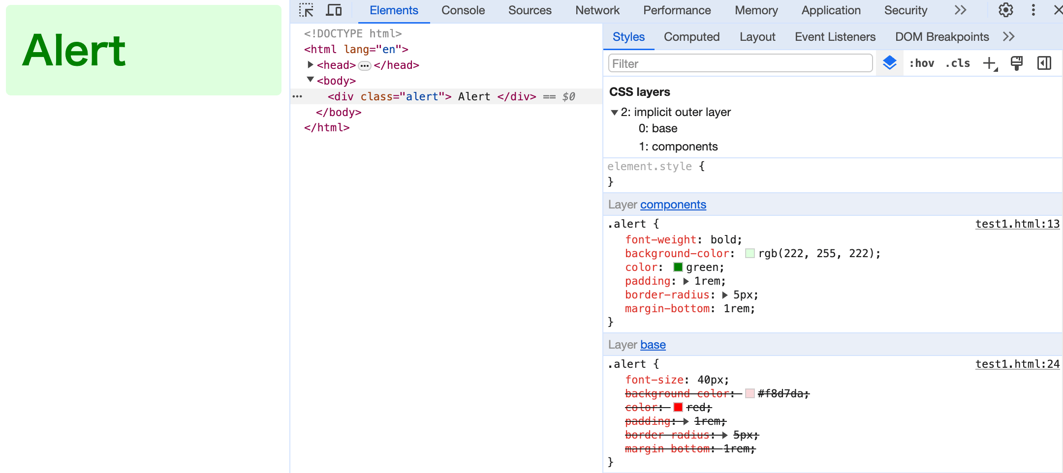
cssのカスケードレイヤー(@layer)の書き方
● cssのカスケードレイヤー(@layer)の書き方
・パターン 1 全てのレイヤーを宣言する場合
/* レイヤー宣言 (後にくるレイヤーの優先順位が高くなる) */
@layer base, components;

@layer components {
  .alert {
    font-weight: bold;
    background-color: rgb(222, 255, 222);
    color: green;
    padding: 1rem;
    border-radius: 5px;
    margin-bottom: 1rem;
  }
}

@layer base {
  .alert {
    font-size: 40px;
    background-color: #f8d7da;
    color: red;
    padding: 1rem;
    border-radius: 5px;
    margin-bottom: 1rem;
  }
}
  <div class="alert">
    Alert
  </div>
・パターン 2 「宣言なし」と「宣言したレイヤー」が存在する場合
    /* レイヤー宣言 (後にくるレイヤーの優先順位が高くなる)(宣言無しは一番優先順位が高くなる) */
    @layer base, components;

    .alert {
      background-color: #d1ecf1;
      color: blue;
      padding: 1rem;
      border-radius: 5px;
      margin-bottom: 1rem;
    }

    @layer base {
      .alert {
        background-color: #f8d7da;
        color: red;
        padding: 1rem;
        border-radius: 5px;
        margin-bottom: 1rem;
      }
    }

    @layer components {
      .alert {
        background-color: rgb(222, 255, 222);
        color: green;
        padding: 1rem;
        border-radius: 5px;
        margin-bottom: 1rem;
      }
    }
  <div class="alert">
    Alert
  </div>

)
)
widthの指定だけで レスポンシブな正方形を作成するcss
● widthの指定だけで レスポンシブな正方形を作成するcss
<!DOCTYPE html>
<html lang="en">

<head>
  <meta charset="UTF-8" />
  <meta http-equiv="X-UA-Compatible" content="IE=edge" />
  <meta name="viewport" content="width=device-width, initial-scale=1.0" />
  <title>Document</title>
  <style>
    * {
      box-sizing: border-box
    }

    .container {
      width: 100%;
      padding: 24px;
    }

    .box {
      width: 100%;
      padding-top: 100%;
      background: green;
    }
  </style>

</head>

<body>
  <div class="container">
    <div class="box"></div>
  </div>
</body>

</html>
Google Map を css でモノクロ(白黒)にする
● Google Map を css でモノクロ(白黒)にする
.google-map iframe {
  filter: grayscale(100%);
}
全てのブラウザ用に配下のようになります。
.google-map iframe {
  -webkit-filter: grayscale(100%);
  -moz-filter: grayscale(100%);
  -ms-filter: grayscale(100%);
  -o-filter: grayscale(100%);
  filter: grayscale(100%);
}
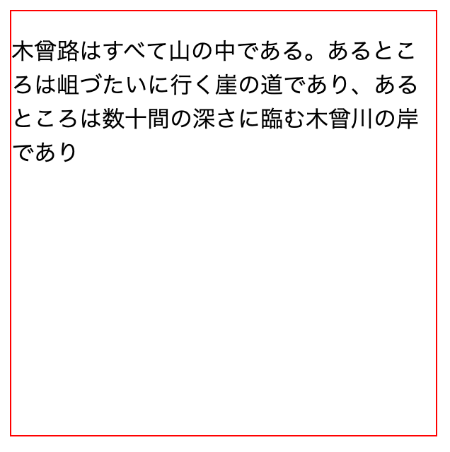
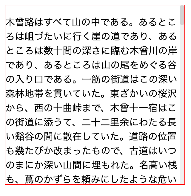
css の scrollでスクロールが発生している時のみスクロールバーを表示させる方法
・スクロールが発生している場合
・スクロールが発生しない場合
<!DOCTYPE html>
<html lang="ja">

<head>
  <meta charset="UTF-8">
  <meta name="viewport" content="width=device-width, initial-scale=1.0">
  <title>スクロールバーの表示</title>
  <style>
    /* スクロールが発生している要素に対してのみスクロールバーを表示 */
    .with-scrollable {
      border: 1px solid red;
      width: 300px;
      height: 300px;
      overflow: auto;
    }

    /* スクロールバーを常時表示 */
    .with-scrollable::-webkit-scrollbar {
      width: 8px;
    }

    /* スクロールバーの背景部分 */
    .with-scrollable::-webkit-scrollbar-track {
      background: #f1f1f1;
    }

    /* スクロールバーのスクロール部分 */
    .with-scrollable::-webkit-scrollbar-thumb {
      background: #D4D4D4;
      border-radius: 4px;
    }

    /* スクロールバーの上部と下部のボタン部分 */
    .with-scrollable::-webkit-scrollbar-button {
      display: none;
    }
  </style>
</head>

<body>
  <div class="with-scrollable">
    <p>
      木曾路はすべて山の中である。あるところは岨づたいに行く崖の道であり、あるところは数十間の深さに臨む木曾川の岸であり、あるところは山の尾をめぐる谷の入り口である。一筋の街道はこの深い森林地帯を貫いていた。東ざかいの桜沢から、西の十曲峠まで、木曾十一宿はこの街道に添うて、二十二里余にわたる長い谿谷の間に散在していた。道路の位置も幾たびか改まったもので、古道はいつのまにか深い山間に埋もれた。名高い桟も、蔦のかずらを頼みにしたような危い場処ではなくなって、徳川時代の末にはすでに渡ることのできる橋であった。新規に新規にとできた道はだんだん谷の下の方の位置へと降って来た。道の狭いところには、木を伐って並べ、藤づるでからめ、それで街道の狭いのを補った。長い間にこの木曾路に起こって来た変化は、いくらかずつでも嶮岨な山坂の多いところを歩きよくした。そのかわり、大雨ごとにやって来る河水の氾濫が旅行を困難にする
      木曾路はすべて山の中である。あるところは岨づたいに行く崖の道であり、あるところは数十間の深さに臨む木曾川の岸であり、あるところは山の尾をめぐる谷の入り口である。一筋の街道はこの深い森林地帯を貫いていた。東ざかいの桜沢から、西の十曲峠まで、木曾十一宿はこの街道に添うて、二十二里余にわたる長い谿谷の間に散在していた。道路の位置も幾たびか改まったもので、古道はいつのまにか深い山間に埋もれた。名高い桟も、蔦のかずらを頼みにしたような危い場処ではなくなって、徳川時代の末にはすでに渡ることのできる橋であった。新規に新規にとできた道はだんだん谷の下の方の位置へと降って来た。道の狭いところには、木を伐って並べ、藤づるでからめ、それで街道の狭いのを補った。長い間にこの木曾路に起こって来た変化は、いくらかずつでも嶮岨な山坂の多いところを歩きよくした。そのかわり、大雨ごとにやって来る河水の氾濫が旅行を困難にする
      木曾路はすべて山の中である。あるところは岨づたいに行く崖の道であり、あるところは数十間の深さに臨む木曾川の岸であり、あるところは山の尾をめぐる谷の入り口である。一筋の街道はこの深い森林地帯を貫いていた。東ざかいの桜沢から、西の十曲峠まで、木曾十一宿はこの街道に添うて、二十二里余にわたる長い谿谷の間に散在していた。道路の位置も幾たびか改まったもので、古道はいつのまにか深い山間に埋もれた。名高い桟も、蔦のかずらを頼みにしたような危い場処ではなくなって、徳川時代の末にはすでに渡ることのできる橋であった。新規に新規にとできた道はだんだん谷の下の方の位置へと降って来た。道の狭いところには、木を伐って並べ、藤づるでからめ、それで街道の狭いのを補った。長い間にこの木曾路に起こって来た変化は、いくらかずつでも嶮岨な山坂の多いところを歩きよくした。そのかわり、大雨ごとにやって来る河水の氾濫が旅行を困難にする
      木曾路はすべて山の中である。あるところは岨づたいに行く崖の道であり、あるところは数十間の深さに臨む木曾川の岸であり、あるところは山の尾をめぐる谷の入り口である。一筋の街道はこの深い森林地帯を貫いていた。東ざかいの桜沢から、西の十曲峠まで、木曾十一宿はこの街道に添うて、二十二里余にわたる長い谿谷の間に散在していた。道路の位置も幾たびか改まったもので、古道はいつのまにか深い山間に埋もれた。名高い桟も、蔦のかずらを頼みにしたような危い場処ではなくなって、徳川時代の末にはすでに渡ることのできる橋であった。新規に新規にとできた道はだんだん谷の下の方の位置へと降って来た。道の狭いところには、木を伐って並べ、藤づるでからめ、それで街道の狭いのを補った。長い間にこの木曾路に起こって来た変化は、いくらかずつでも嶮岨な山坂の多いところを歩きよくした。そのかわり、大雨ごとにやって来る河水の氾濫が旅行を困難にする
      木曾路はすべて山の中である。あるところは岨づたいに行く崖の道であり、あるところは数十間の深さに臨む木曾川の岸であり、あるところは山の尾をめぐる谷の入り口である。一筋の街道はこの深い森林地帯を貫いていた。東ざかいの桜沢から、西の十曲峠まで、木曾十一宿はこの街道に添うて、二十二里余にわたる長い谿谷の間に散在していた。道路の位置も幾たびか改まったもので、古道はいつのまにか深い山間に埋もれた。名高い桟も、蔦のかずらを頼みにしたような危い場処ではなくなって、徳川時代の末にはすでに渡ることのできる橋であった。新規に新規にとできた道はだんだん谷の下の方の位置へと降って来た。道の狭いところには、木を伐って並べ、藤づるでからめ、それで街道の狭いのを補った。長い間にこの木曾路に起こって来た変化は、いくらかずつでも嶮岨な山坂の多いところを歩きよくした。そのかわり、大雨ごとにやって来る河水の氾濫が旅行を困難にする
    </p>
  </div>
</body>

</html>
)
)
「ある要素を内包する要素」の css セレクタ has()
● 「ある要素を内包する要素」の css セレクタ has()
a.active を 内側に持つ li の場合
    & li:has(> a.active) {
      border: 10px solid red;
    }
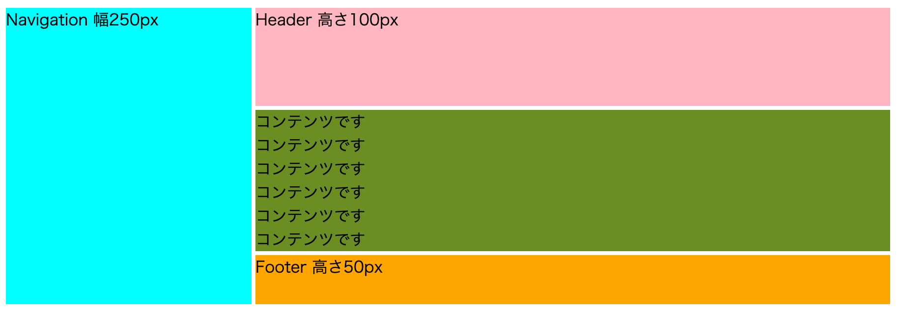
css grid の header , footer , nav , main のよく使う例
<!DOCTYPE html>
<html lang="ja">
<head>
  <meta charset="UTF-8">
  <title>Grid Sample</title>
  <style>
    .ComplexGrid {
      display: grid;

      grid-template:
        "Navigation Header" 100px
        "Navigation Main"
        "Navigation Footer" 50px
        / 250px auto
      ;

      gap: 4px;
    }

    .ComplexGrid__Navigation {
      grid-area: Navigation;
      background-color: aqua;
    }

    .ComplexGrid__Header {
      grid-area: Header;
      background-color: lightpink;
    }

    .ComplexGrid__Footer {
      grid-area: Footer;
      background-color: orange;
    }

    .ComplexGrid__Main {
      grid-area: Main;
      background-color: olivedrab;
    }
  </style>
</head>
<body>
  <div class="ComplexGrid">
    <div class="ComplexGrid__Navigation">Navigation 幅250px</div>
    <div class="ComplexGrid__Header">Header 高さ100px</div>
    <div class="ComplexGrid__Footer">Footer 高さ50px</div>
    <div class="ComplexGrid__Main">
      コンテンツです<br>
      コンテンツです<br>
      コンテンツです<br>
      コンテンツです<br>
      コンテンツです<br>
      コンテンツです<br>
    </div>
  </div>
</body>
</html>
<body>
  <div class="container">
    <div class="red"></div>
    <div class="blue"></div>
    <div class="green"></div>
  </div>
</body>

.container {
  width: 480px;
  height: 300px;
  display: grid;
  grid-template:
    "Blue Green" 1fr
    "Red Red" 1fr
}

.blue {
  grid-area: Blue;
  background-color: blue;
}

.green {
  grid-area: Green;
  background-color: green;
}

.red {
  grid-area: Red;
  background-color: red;
}

)
)
css の min() max() minmax() clamp()
● min()
min() は CSS 関数で、 CSS プロパティの値としてカンマで区切られた式のリストから最小の (最も負である) 値を設定できます。
例
.box {
 width: 50vw;
 max-width: 600px;
}
↓ 同じ
.box {
  width: min(50vw, 600px);
}
● max()
max() は CSS の関数で、 CSS プロパティの値としてカンマで区切られた式のリストから最大の (最も正である) 値を設定できます。
.box {
 width: 50vw;
 min-width: 400px;
}
↓ 同じ
.box {
  width: max(50vw, 400px);
}
● minmax()
minmax() は CSS の関数で、寸法の範囲を min 以上、 max 以下で定義します。 CSS グリッドで使用されます。
display: grid; 用です。
● clamp()
clamp() は CSS の関数で、値を上限と下限の間に制限します。 clamp() によって、定義された最大値と最小値の間の値を選択することができます。最小値、推奨値、最大値の3つの引数を取ります。
.box {
  width: clamp(400px, 50vw, 600px);
}
display: none → block でアニメーション
  .display-none{
    display: none;
  }
  .display-none.active{
    display: block;
    animation: appear .5s ease;
  }
  @keyframes appear {
    0%{
      opacity: 0;
    }
    100%{
      opacity: 1;
    }
  }
横並びにしたdivを「1つだけ自動伸縮」にし「残りは固定」にして「全体も自動伸縮」にする
  <div class="grid-container">
    <div class="fixed">Fixed</div>
    <div class="flexible">テスト太郎</div>
    <div class="fixed">Fixed</div>
    <div class="fixed">Fixed</div>
  </div>
.grid-container {
  display: grid;
  grid-template-columns: 50px auto 50px 50px; /* 1つ目, 3つ目, 4つ目のdivは固定幅、2つ目のdivは可変幅にします */
  max-width: 500px;
  width: min-content; /* 要素の幅がその内容に合わせて調整されます */
}

.fixed {
  overflow: hidden; /* 必要に応じて、テキストがdivを超えた場合にスクロールできるようにします */
}

.flexible {
  white-space: nowrap; /* 改行を無視して一行に収める */
}
css で 親子、兄弟のセレクタ
● 子孫結合子 ( 空白 )
divタグの中のpタグ全て
div p {
    border: 1px solid red;
}
● 子結合子 ( > )
divタグの直下のpタグ全て
div > p {
    border: 1px solid red;
}
● 隣接兄弟結合子 ( A + B )
h1タグに 隣接するpタグ
h1 + p {
    border: 1px solid red;
}
● 一般兄弟結合子 ( A ~ B )
兄に .selected を持つ 弟の div タグ
(弟のみ赤いラインで囲まれます)
<div>未選択<div>
<div class=".selected">選択ずみ<div>
<div>弟<div>
<div>弟<div>
.selected ~ div {
    border: 1px solid red;
}
svg アイコンの線や背景の色をcssで変更する
● svg アイコンの線や背景の色をcssで変更する
● A. ❌ <img src=>読み込み + 「cssの fill または stroke による色変更」 は出来ません。
残念ながらこれはできないようです。
● B. <img src=>によるsvg読み込み + 「css の filter による色変更」→ こちらはOKです。
こちらのサイト に変換したい色を入力すると、黒色から指定の色に変換する filter を生成してくれます。
svg アイコンは黒色で作成しておく必要があります。
https://codepen.io/sosuke/pen/Pjoqqp
もし 白色のアイコンの場合は
background-color: #000;
を #fff に変更します。
例
<img src="icon.svg" class="icon">

<style>
.icon {
filter: invert(64%) sepia(25%) saturate(4945%) hue-rotate(168deg) brightness(93%) contrast(88%);
}
</style>
● C. インラインsvg読み込み + cssによる色変更
svg をhtml内にコードとして貼り付けて、class をつけて、 fill または stroke プロパティで色をつけます
cssファイル自身のlazyload (preload)
● A. rel="preload" で、読み込ませて読み込み後にスタイルに変更する
<link rel="stylesheet" href="style.css">
↓
<link rel="preload" href="style.css" as="style" onload="this.onload=null;this.rel='stylesheet'">
● B. media="print" onload="this.media='all'"をつけて読み込ませる
<link rel="stylesheet" href="style.css">
↓
<link rel="stylesheet" href="style.css" media="print" onload="this.onload=null; this.media='all'" />
● B. link rel="preload" を使用する
<link rel="stylesheet" href="style.css">
↓
<link rel="preload" href="style.css" as="style">
この先読みはあくまで後で使うためにリソースを先に読んでおくだけで、実行(適用)はされません
cssで position : fixed な要素を中央に配置する(上下左右センタリング)
● cssで position : fixed な要素を中央に配置する(上下左右センタリング)
新しい記述方法
.popup{
  position: fixed;
  inset: 0;
  margin: auto;
}
昔の記述方法
.popup{
  position: fixed;
  left: 50%;
  top: 50%;
  transform: translateX(-50%)
             translateY(-50%);
}
flex で フッターの画面下固定
● flex で フッターの画面下固定
margin-top: auto; で画面下固定になります。
.container {
  height: 100%;

  display: flex;
  flex-wrap: wrap;
  flex-flow: column;
}

.footer {
  margin-top: auto;
}
高さが半分の br
● 高さが半分の br
.br_half {
  display: block;
  content: "";
  margin: 0.5em 0;
}
<br class="br_half">
Pico.css を使用する
● Pico.css
● Pico.css のインストール
作業フォルダに移動してから次のコマンドを実行します
npm install -g sass

npm install @picocss/pico

mkdir src
mkdir src/scss

cp -r ./node_modules/@picocss/pico/scss ./src/scss/pico_scss
ディレクトリやファイル構成は次のようになります
.
├── node_modules(使用しない)
└── src
    ├── css
        └── pico.css(このファイルをhtmlから読み込む)
    └── scss
        └── pico_scss
             └── pico.scss(このファイルをコンパイルする)
● Pico.css のコンパイル
src/css/pico.css を生成します
sass ./src/scss/pico_scss/pico.scss ./src/css/pico.css
● index.html を用意する
.src/index.html
<!DOCTYPE html>
<html lang="ja">
<head>
<meta charset="UTF-8">
<meta name="viewport" content="width=device-width, initial-scale=1.0">
<link rel="stylesheet" href="./css/pico.css">
<title>Document</title>
<style>
.grid div {
padding: calc(var(--spacing)/ 2) 0;
border-radius: var(--border-radius);
background: var(--code-background-color);
font-size: 87.5%;
text-align: center;
}
</style>
</head>
<body>
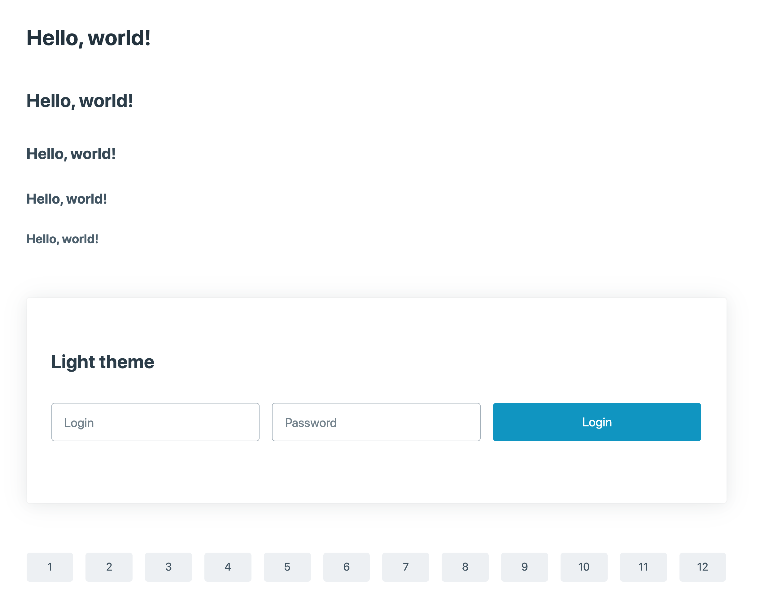
<main class="container">
<h1>Hello, world!</h1>
<h2>Hello, world!</h2>
<h3>Hello, world!</h3>
<h4>Hello, world!</h4>
<h5>Hello, world!</h5>
<h6>Hello, world!</h6>
<article data-theme="light" aria-label="Forced light theme example">
<h3>Light theme</h3>
<form class="grid">
<input type="text" name="login" placeholder="Login" aria-label="Login" autocomplete="nickname" required="">
<input type="password" name="password" placeholder="Password" aria-label="Password" autocomplete="current-password" required="">
<button type="submit" aria-label="Example button" onclick="event.preventDefault()">Login</button>
</form>
</article>
<div class="grid">
<div>1</div>
<div>2</div>
<div>3</div>
<div>4</div>
<div>5</div>
<div>6</div>
<div>7</div>
<div>8</div>
<div>9</div>
<div>10</div>
<div>11</div>
<div>12</div>
</div>
</main>
</body>
</html>
ブラウザで index.html を表示させます
● (pico.cssのカスタマイズ)ボタンの色を赤に変える
./src/scss/pico_scss/themes/default/_colors.scss
// Light Blue
$primary-hue: 195 !default;
↓
// Light Blue
$primary-hue: 360 !default;
として再度コンパイルするとボタンの色が変わります。
● (pico.cssのカスタマイズ) ブレークポイントを減らして2レスポンシブにしてみる
./src/scss/pico_scss/_variables.scss
$breakpoints: (
  xs: 0,
  sm: 576px,
  md: 1002px,
  lg: 1002px,
  xl: 1002px,
) !default;

// Viewports
// 'null' disable the viewport on a breakpoint

$viewports: (
  sm: 510px,
  md: 1000px,
  lg: 1000px,
  xl: 1000px
) !default;
● VS Codeでコンパイルする
DartJS Sass Compiler and Sass Watcher https://marketplace.visualstudio.com/items?itemName=codelios.dartsass
)
印刷用CSSで任意の位置で改行を送信する
● 印刷用CSSで任意の位置で改行を送信する
css
.page-break-before  {
    page-break-before:always
}
html
<div class="page-break-before">
<p>この文章の直前で改ページさせる</p>
</div>
テーブルに設定する場合は次のようにします
<head>
    <style>
        @media print {
            tr.page-break  { display: block; page-break-before: always; }
        }
    </style>
</head>
<tr class="page-break"></tr>
table ヘッダ 固定のcss
tabl ヘッダを固定して、テーブルのスクロールさせるcssです。 テーブル全体をラッパータグで囲います。
css
.mytable__wrapper {
    height: 100px;
    overflow-y: scroll;
}
table.mytable {
	text-align: left;
	position: relative;
	border-collapse: collapse;
}
table.mytable th,
table.mytable td{
	padding: 1rem;
	border: solid 1px #ddd;
}
table.mytable th {
    color: red;
	background: white;
	position: sticky;
	top: 0;
}
<div class="mytable__wrapper">
    <table class="mytable">
      <thead>
        <tr>
          <th>見出し1</th>
          <th>見出し2</th>
          <th>見出し3</th>
          <th>見出し4</th>
          <th>見出し5</th>
        </tr>
      </thead>
      <tbody>
        <tr>
          <td>データ1</td>
          <td>データ2</td>
          <td>データ3</td>
          <td>データ4</td>
          <td>データ5</td>
        </tr>
        <tr>
          <td>データ1</td>
          <td>データ2</td>
          <td>データ3</td>
          <td>データ4</td>
          <td>データ5</td>
        </tr>
        <tr>
          <td>データ1</td>
          <td>データ2</td>
          <td>データ3</td>
          <td>データ4</td>
          <td>データ5</td>
        </tr>
        <tr>
          <td>データ1</td>
          <td>データ2</td>
          <td>データ3</td>
          <td>データ4</td>
          <td>データ5</td>
        </tr>
        <tr>
          <td>データ1</td>
          <td>データ2</td>
          <td>データ3</td>
          <td>データ4</td>
          <td>データ5</td>
        </tr>
      </tbody>
    </table>
    </div>
css ul li 改行を揃える
● css ul li 改行を揃える
ul {
	padding-left: 20px;
	list-style-type: disc;
	list-style-position: outside;
}
cssの display:flex で 右端にそろえる / 両端に揃える
● cssの display:flex で 右端に揃える
.my_container {
    display: flex;
  justify-content: flex-end;
}
● cssの display:flex で 両端に揃える
.my_container {
    display: flex;
    justify-content:space-between;
    flex-wrap: wrap;
}
css transition ページ読み込み時 オフ
● css transitionを ページ読み込み時にだけオフにする( for Google Chrome)
対応方法 : CSS ファイルを読み込んだ後になんかしらの JavaScript を実行すれば OK です。
    <link rel="stylesheet" href="/assets_front/css/style.css">
    <script>console.log("prevent Google Chrome css Transition");</script>
css で 最後の要素以外または最初の要素以外(2番目以降)のセレクタ
● CSSで「spanタグの最後の要素以外」を指定する
span:not(:last-child) {
    margin-right: 25px;
}
span:not(:last-of-type) {
    margin-right: 25px;
}
● CSSで「spanタグの最初の要素以外(2番目以降)」を指定する
span:not(:first-of-type) {
    margin-right: 25px;
}
● last-child と last-of-type の違い
:first-childの定義の勘違いが主な原因です。
最初に現れる子要素、という指定は、指定したプロパティの中で最初に現れるこ要素ということではなく、全てのタグを含めた初めに現れる子要素という意味です。
どうゆうことかというと。
Mac OS Catalina (10.15)のフォント問題に対応する
● サンセリフになってしまう問題
font-family: Meiryo, "Hiragino Kaku Gothic ProN", sans-serif
↓
font-family: Meiryo, "Hiragino Kaku Gothic ProN", "Hiragino Sans", sans-serif
"Hiragino Sans" を追加する。
● font-weight:bold がかなり太くなる問題
font-weight:bold;
↓
font-weight:600;
font-weight:600; に変更する。
引用: https://speakerdeck.com/clockmaker/better-font-family-2019-in-japanese
css「複数行または1行のテキスト」を縦センタリング する
display: flex; を使用します。
.waku {
	padding: 0 15px 0 15px;
	width: 400px;
	height: 150px;
	border: solid red 1px;

	display: flex;
	justify-content: center;
	align-items: center;
	text-align:  center;
}
.elem {
	flex: 1;
}
デモ : https://pgmemo.tokyo/livedemo/css_flex_vertical_center/css_flex_vertical_center.html
背景画像を複数指定する
● css で 背景画像を複数指定する
まとめて指定する例:
    background:
        url("waku_border.svg") 0px 65px repeat-x,
        url("waku.png") 0px 70px repeat-x;
別々に指定する例:
    background-image:
        url("waku_border.svg") ,
        url("waku.png");

    background-position:
        0px 65px ,
        0px 70px;

    background-repeat:
     repeat-x,
     repeat-x;
cssで背景画像をスマホサイズに合わせて自動でサイズ変更させる
● 背景画像をレスポンシブにしてスマホサイズに合わせて自動でサイズ変更させる
● A. 100%表示の場合
html
<div class="myimg">風景写真。このテキストは非表示になります。</div>
scss
.myimg {
    background: url("#{$img_folder}/xxxxx.jpg") 0 0 no-repeat;
    height: 0;
    padding-top: 75.15%;        // 画像の高さを100%とした時の画像の幅%
    background-size: contain;

    overflow: hidden;
    text-indent: -100%;
    white-space: nowrap;
}
● B. width , height を指定する場合
html
<div class="myimg">風景写真。このテキストは非表示になります。</div>
scss
.myimg {
    width: calc( 50vw - 20px );
    width: calc( (50vw - 20px) * 0.7515 );

    background: url("#{$img_folder}/xxxxx.jpg") 0 0 no-repeat;
    background-size: contain;

    overflow: hidden;
    text-indent: -100%;
    white-space: nowrap;
}
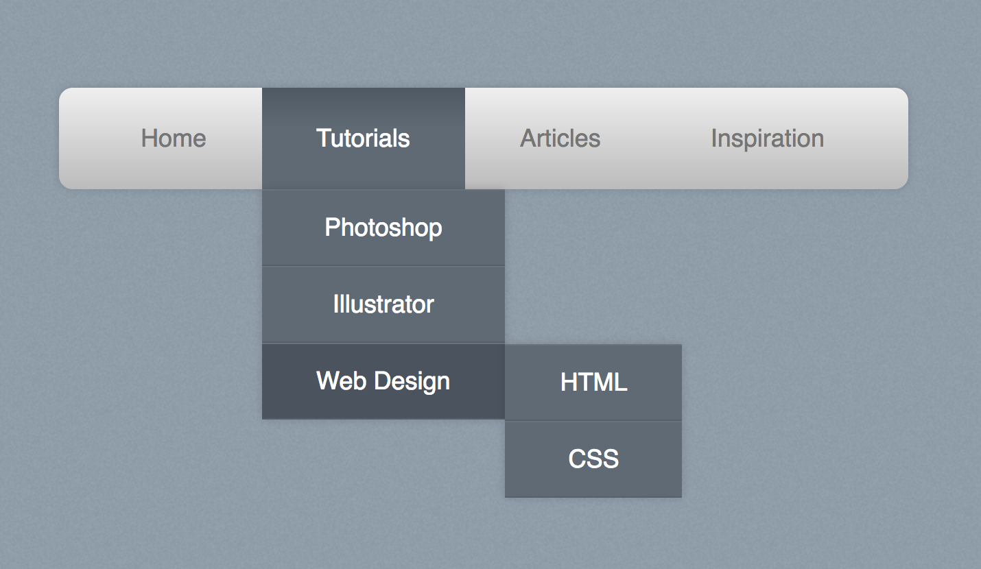
css3だけでグローバルメニューに使えるシンプルなドロップダウンメニューを作成する
● css3だけでグローバルメニューに使えるシンプルなドロップダウンメニューを作成する
How To Create a Pure CSS Dropdown Menu こちらで紹介されています。
デモ
https://line25.com/wp-content/uploads/2012/css-menu/demo/index.html
)
cssで position : absolute な要素を中央に配置する(上下左右センタリング)
● position : absolute でセンタリング
親DIVに
position: relative;
を指定してから、センタリングしたい要素に以下の指定を行います。
.absolute_center {
	position  : absolute;
	top       : 50%;
	left      : 50%;
	transform : translate(-50%, -50%);
}
デモ : https://pgmemo.tokyo/data/filedir/1249_1.html
● margin vh でセンタリング
.margin_vh_center {
	margin    : 50vh auto 0;
	transform : translateY(-50%);
}
デモ : https://pgmemo.tokyo/data/filedir/1249_2.html
どちらも Windows IE11 OK! です
引用 : https://coliss.com/articles/build-websites/operation/css/absolute-centering-with-css.html